partnership
Odido
Services
Web, App & ConversationalDesign system, Brand Experience StrategyT-Mobile approached us with a compelling mission – to embark on a brand transformation journey that ultimately gave rise to Odido.
Our journey began with deciphering their core values and translating them into guiding principles for a transformative brand experience. We meticulously sculpted a versatile, multi-platform design system that resonates with Odido’s ultimate purpose: to establish a human connection.
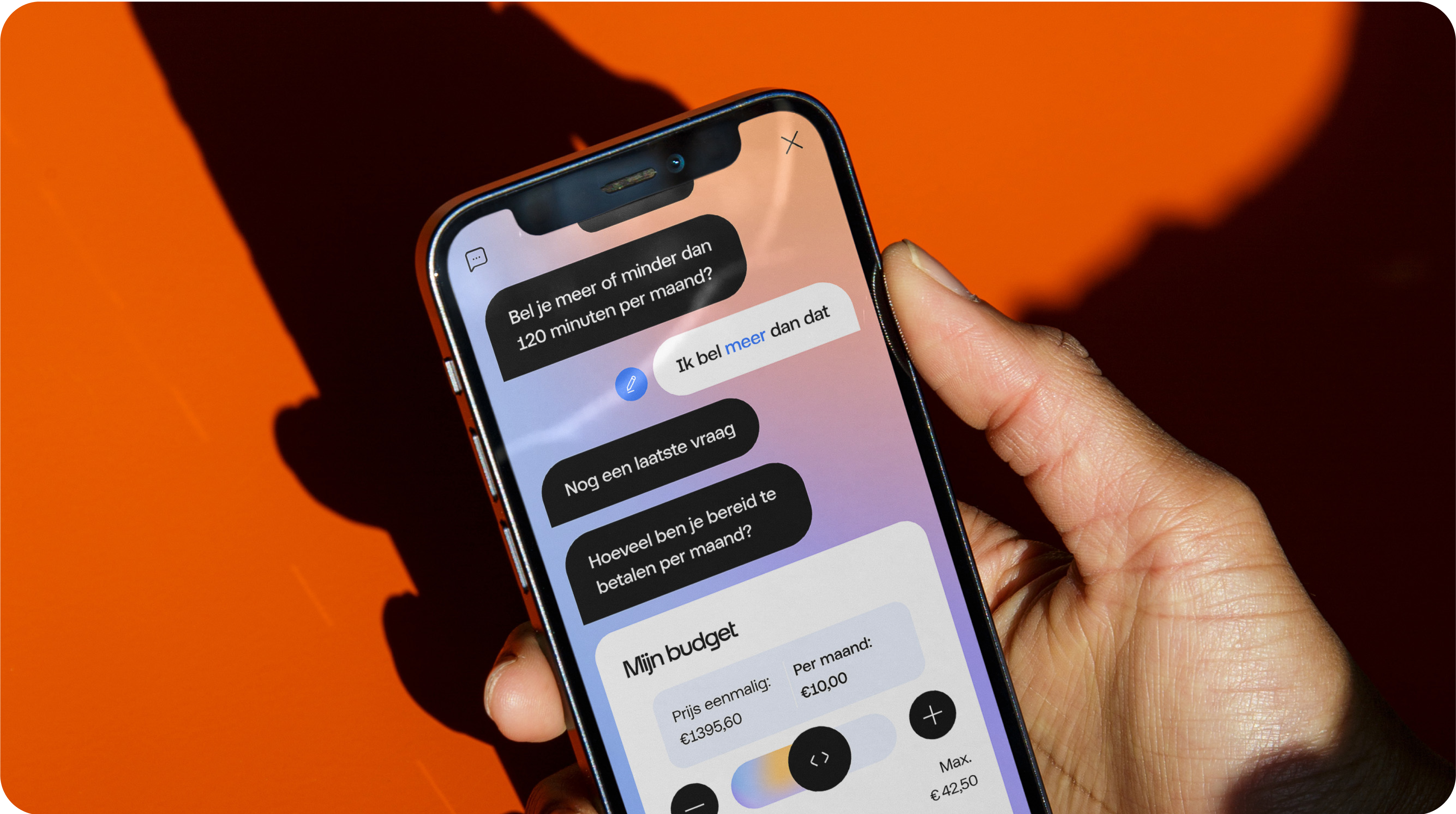
The digital brand experience for Odido
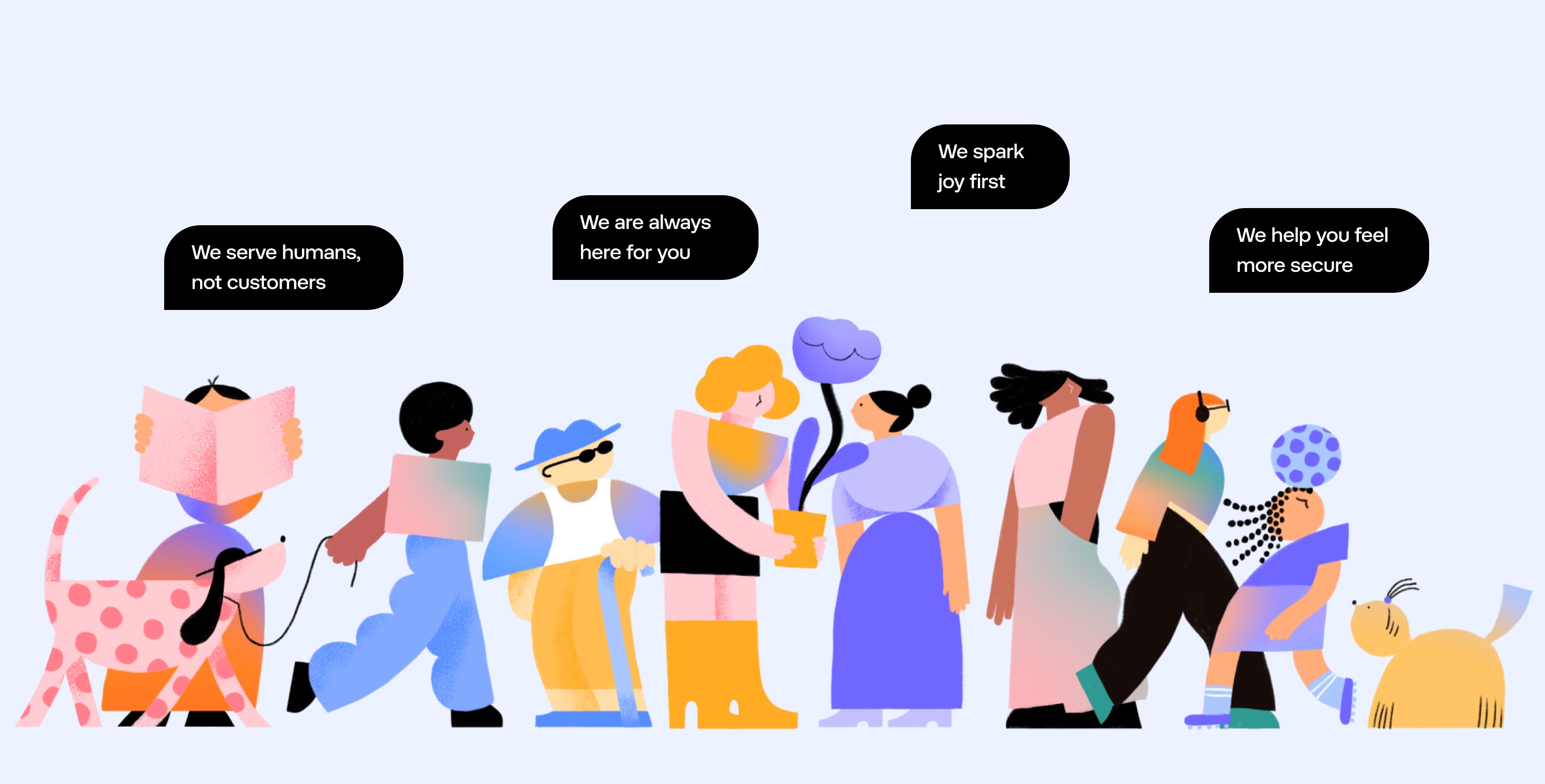
After extensive workshops, interviews, and weeks of dedicated research and design efforts, we distilled the essence of the new brand around these four core values:
These core values underpin every facet of the new brand, influencing everything from our tone of voice and design system to our choice of imagery and color palette.
A design system that is consistent, scalable, easy to implement
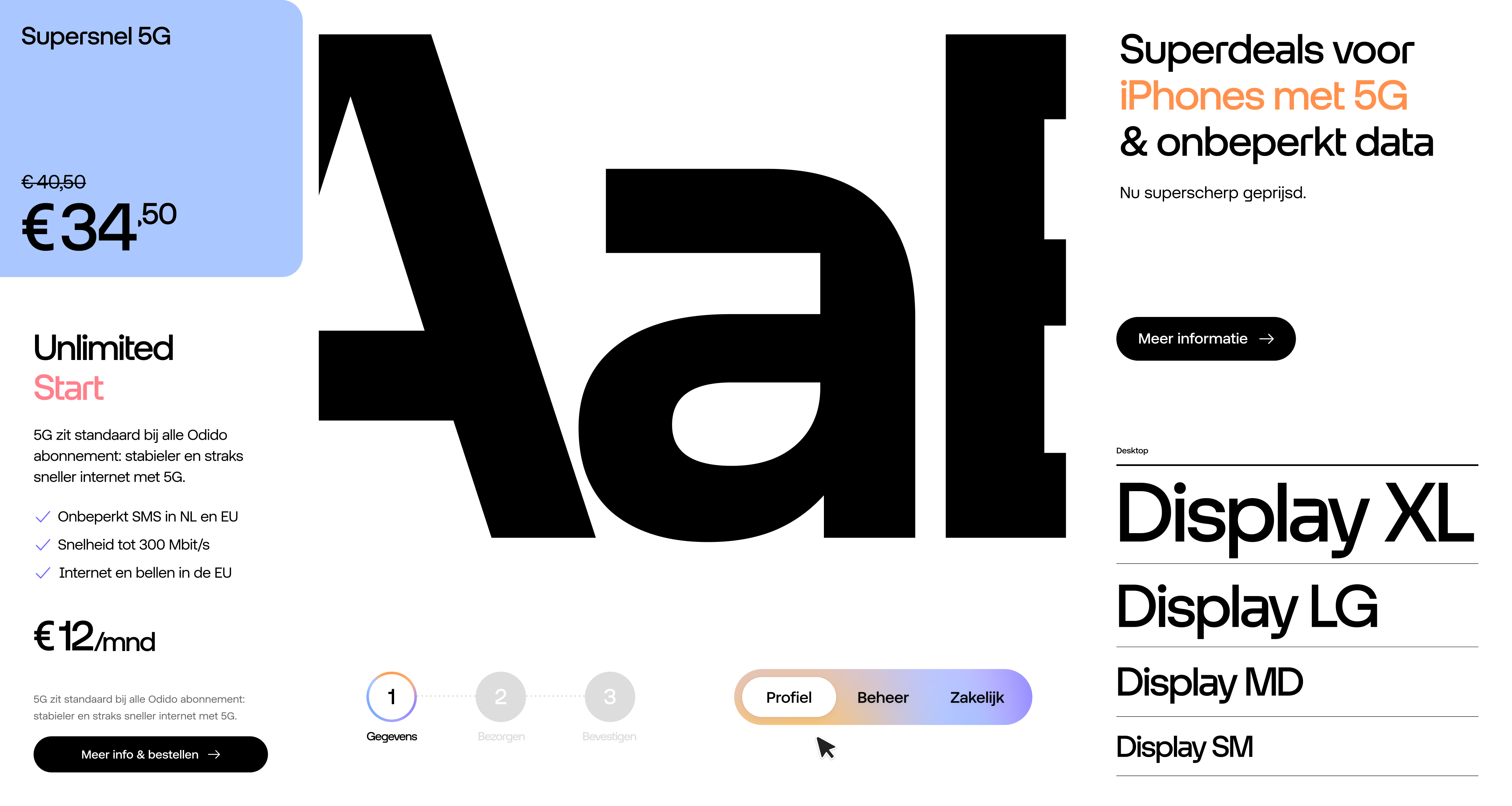
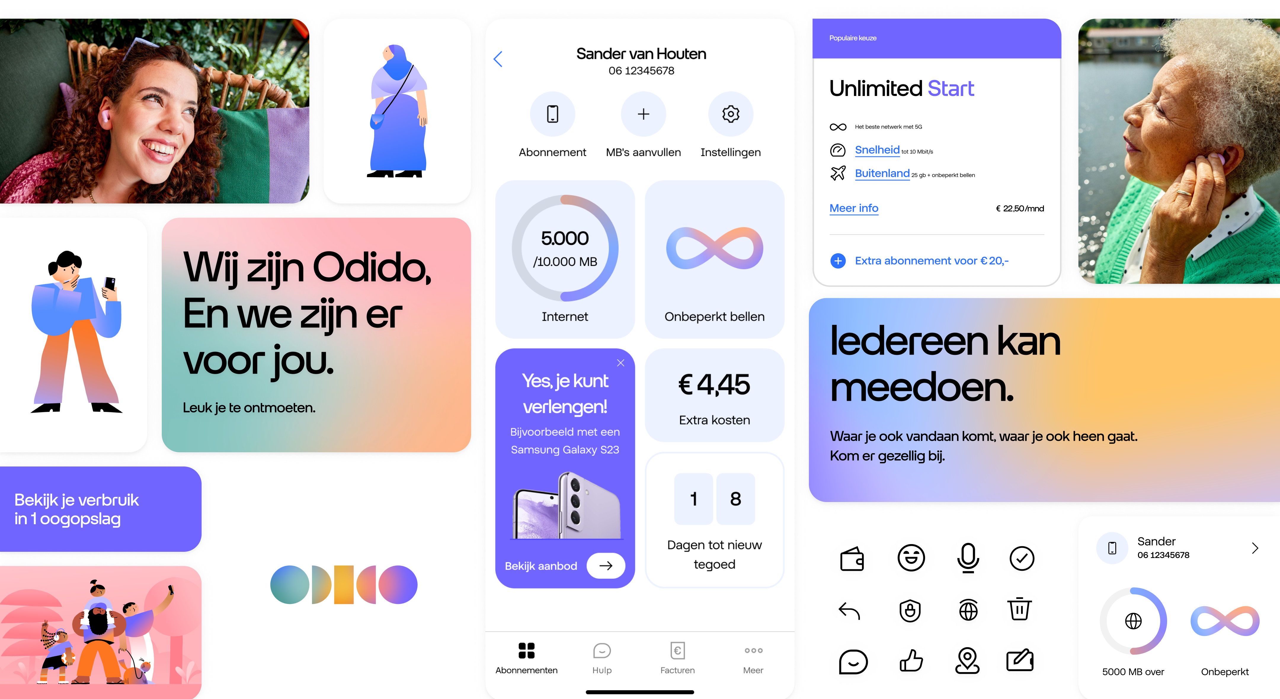
We took these brand values and transformed them into a versatile design system, built upon strong and easily applicable foundations. This system is not only scalable but also highly adaptable to various contexts. It leverages the brand's distinctive colors, typography, icons, and shapes to evoke a profound sense of security and reliability.
Throughout our design system, you'll find the unmistakable 'bubble' shape, serving as a unifying element. When infused with motion, it subtly alludes to Odido's central product: facilitating human connection through seamless communication.
A unified visual language across every touchpoint
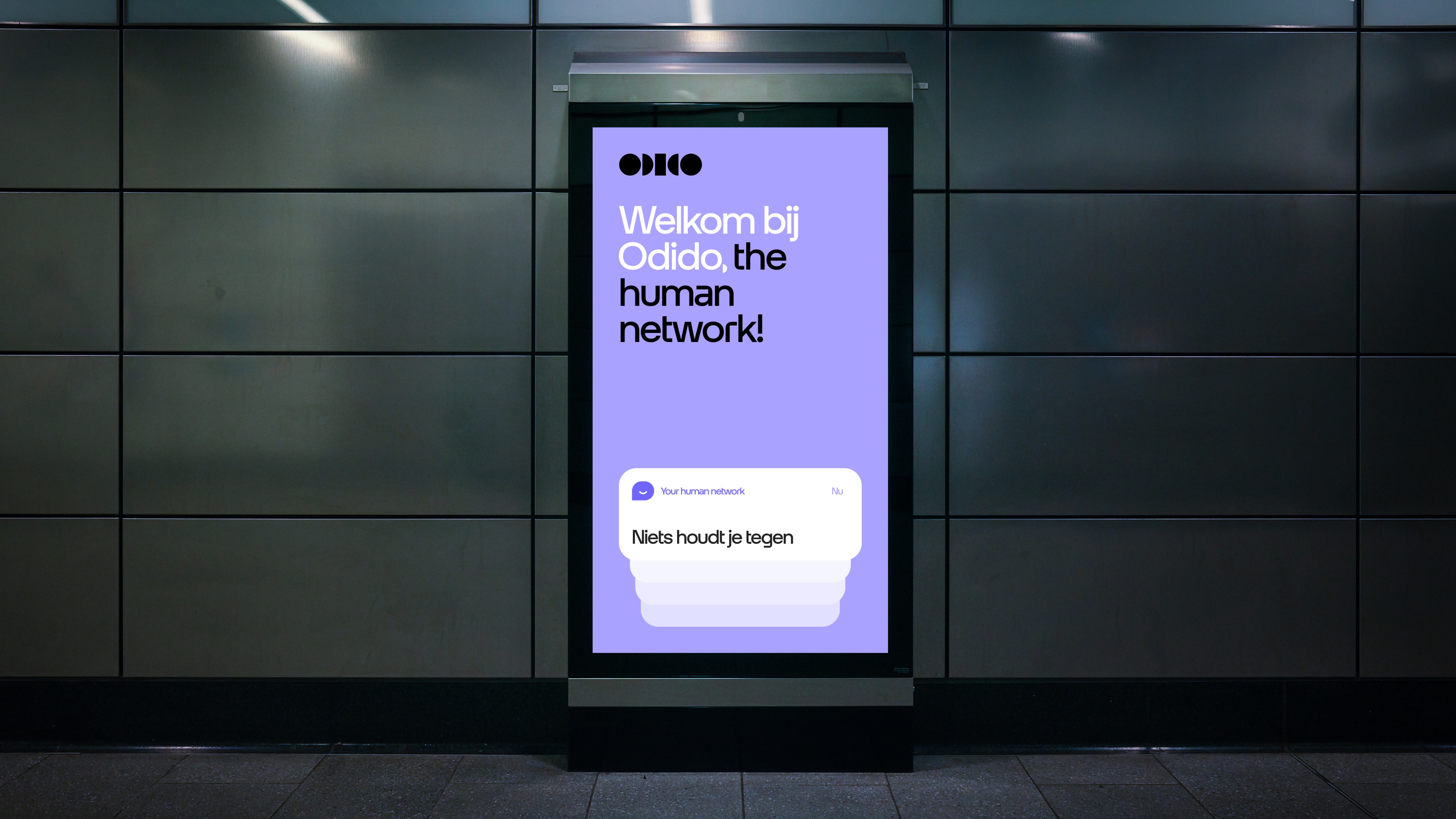
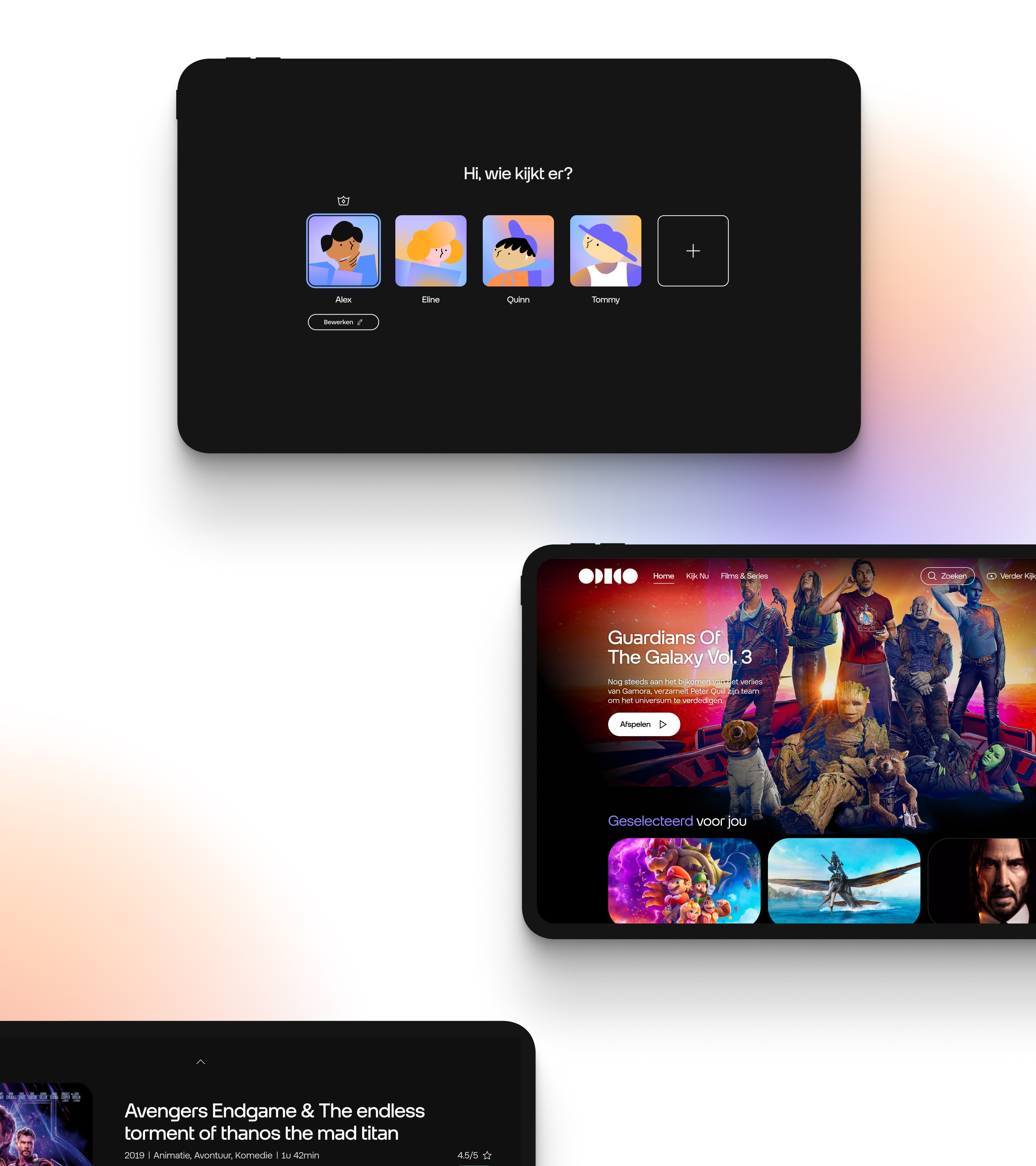
Our task was to establish the digital design foundation for Odido. To accomplish this, we carefully crafted a design system that prioritizes consistency, scalability, and ease of implementation. This versatile system enables us to create content for a wide range of platforms, from emails and television to billboards, apps, and websites, all while maintaining a unified visual identity across every touchpoint.
Our design system features custom-made icons, as well as custom typography which was developed from scratch, and a seamlessly integrated motion system. Additionally, we've incorporated basic accessibility practices, all with the aim of making technology more accessible and human-centric.
We've crafted a design system that's both consistent and versatile, designed for seamless scalability and easy implementation. This system extends seamlessly from the web to billboards, television, and apps. It offers a fresh and friendly visual identity for Odido, which was revealed to the world on September 5th. Certainly no small feat for a brand with millions of customers.
Ready to elevate your brand? Reach out.
